Correlation analysis (along with seasonal analysis) is one of the main elements of the descriptive analysis of time series data. Furthermore, those patterns and insights revealed in the descriptive analysis play a pivotal role in the building process of a forecasting model. A common example is the setting of the AR and MA processes of the ARIMA models, which can be done with the autocorrelation and partial autocorrelation functions. Typically, time-series data will have some degree of correlation with its past lags. This can be seen in the hourly temperatures, as the current temperature is most likely to be close to the one during the previous hour. Moreover, correlation is also could reveal seasonal patterns as it is most likely that the series will have a high correlation with its seasonal lags. The TSstudio provides several tools for correlation analysis, such as ts_cor, ts_lags, and ccf_plot.
The ACF and PACF functions
Traditionally, the acf (autocorrelation) and pacf (partial autocorrelations) functions from the stats package are used to calculate and plot the correlation relationship between the series and its lags. The ts_cor function provides an interactive wrapper and flexible version for those functions. Let’s load the UKgrid series from the UKgrid package. This series represents the demand for electricity in the UK. Will use the extract_grid function to aggregate the series to daily frequency:
Before plotting the ACF and PACF of the series, let’s review the series main characteristics:
library(TSstudio)

ts_info(UKgrid_daily)
#>  The UKgrid_daily series is a ts object with 1 variable and 5304 observations
#>  Frequency: 365
#>  Start time: 2005 91
#>  End time: 2019 284

ts_plot(UKgrid_daily)
It is easy to observe, just by looking at the plot above, that the series has a strong seasonal component across the day of the year. If you zoom in, you can also observe that the series has a strong seasonal component across the day of the week (e.g., high consumption during the normal working days of the weeks and relatively low consumption throughout the weekend days). Quantify those relationships can be done by measuring the level of correlation between the series and its different seasonal lags. One of the downsides of the acf and pacf functions that it is hard to isolate a specific seasonal lag and compare that relationship over time. For example, the below plots represent the ACF and PACF relationship of the demand for electricity with its past 730 lags (or two seasonal cycles):
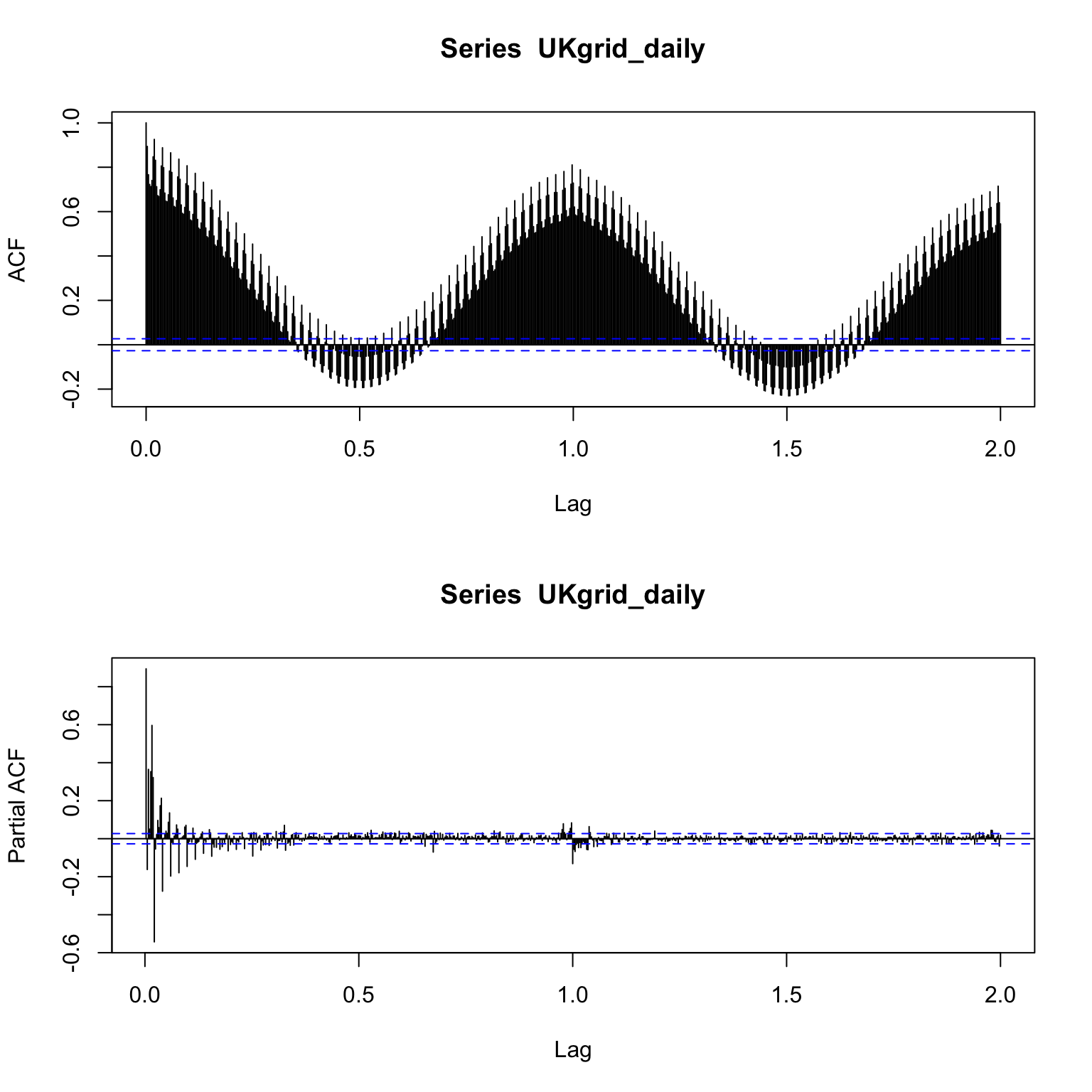
You can observe from the ACF plot above that the series is highly correlated with both its default seasonal lags (i.e., frequency 365) and also with the close lags. Yet, it is hard to compare between the two due to the high density of the plot. The ts_cor solve this issue by providing a more friendly plot of the ACF and PACF functions:
Note that the X-axis legend of the ts_cor plot represents the actual lags number (i.e., 1 for the first lag, 2 for the second, etc.), as opposed to the acf plot that represents the seasonal lags (i.e., 1/frequency for the first lag, or 1 for the first seasonal lag). In addition, the interactivity feature of the plot enables to view in more detail a specific range of lags by zoom in it. For example, in the plot above, if zoom in on the seasonal lag, you can notice that lag 364 is actually is more correlated with the series than the seasonal lag 365. This indicates that the series has a high correlation with the day of the week (or lags 7, 14, 21, etc.), as the order of the lag 364 series aligns with the corresponding day of the week of the series itself (as the reminder of 364 by 7 is 0).
The seasonal argument, when set to TRUE, allows you to distinguish the seasonal lags from the non-seasonal lags. In addition, you can remove the non-seasonal lags by clicking on the non-seasonal legend. This is very useful to tune the seasonal components of SARIMA model. The seasonal_lags argument allows you to mark and distinguish other seasonal lags, besides the default one. For instance, add to the plot the weekly lags by setting the seasonal_lags to 7:
Lags plot
Lags plot is an alternative approach for visualizing the relationship between the series and its lags. As linear the relationship between the series and its lags, the higher the correlation between the two. For example, let’s plot the relationship of the demand for electricity with its first 7 lags:
As observed with the ACF plot above, the series has a strong linear relationship with the first and seventh lags. The lags argument enables to plot specific lags. For instance, let’s compare the dominant lags (7, 364, and 365), as observed by the ACF plot above:
Similarly to what we observed with the ACF plot above, it is easy to observe in the plot above that the series has a stronger linear relationship with lag 7 and 364.
Cross correlation plot
The ccf_plot (cross-correlation plot) function helps to identify if two series (i.e., series y and x) are correlated and the strength of it. The function returns a sequence of plots of series y aginst the past and/or the leading lags of series x and the cross-correlation value. The cross-correlation value is calculated by the ccf function from the stats package. Let’s use the function to explore the relationship between the monthly unemployment rate and the total vehicle sales in the US. The two series available on the TSstudio package:
data("USUnRate")
data("USVSales")

ts_info(USUnRate)
#>  The USUnRate series is a ts object with 1 variable and 864 observations
#>  Frequency: 12
#>  Start time: 1948 1
#>  End time: 2019 12

ts_info(USVSales)
#>  The USVSales series is a ts object with 1 variable and 528 observations
#>  Frequency: 12
#>  Start time: 1976 1
#>  End time: 2019 12
Before using the ccf_plot function, let’s first plot the two series side by side. We will use the ts_to_prophet function from the TSstudio to convert the ts object to data.frame, and then merge and plot them with the dplyr and plotly packages respectively:
# Converting the ts object to data.frame
us_rate_df <- ts_to_prophet(USUnRate)
us_vsales_df <- ts_to_prophet(USVSales)


library(dplyr)

# Merge the two tables
df <- us_rate_df %>%
  inner_join(us_vsales_df, by = "ds", ) %>%
  setNames(c("date", "Unemployment Rate", "Vehicle Sales")) %>%
  arrange(date)

head(df)
#>         date Unemployment Rate Vehicle Sales
#> 1 1976-01-01               8.8         885.2
#> 2 1976-02-01               8.7         994.7
#> 3 1976-03-01               8.1        1243.6
#> 4 1976-04-01               7.4        1191.2
#> 5 1976-05-01               6.8        1203.2
#> 6 1976-06-01               8.0        1254.7
# Plotting the object
library(plotly)
plot_ly(data = df) %>%
add_lines(x = ~ date, y = ~ `Vehicle Sales`, name = "Vehicle Sales") %>%
add_lines(x = ~ date, y = ~ `Unemployment Rate`, yaxis = "y2", line = list(color = "red"), name = "Unemployment Rate") %>%
layout(
title = "US Monthly Vehical Sales vs. Unemployment Rate",
yaxis2 = list(
title = "%",
overlaying = "y",
side = "right",
title = "second y axis"
),
xaxis = list(title=" Thousands of units")
)Looking at the plot above, it is easy to observe that the series has an inverse relationship. In other words, when the vehicle sales are dropping down, the unemployment rate is going up and the opposite around. Let’s use the ccf_plot function to evaluate the cross-correlation between the unemployment rate and the past lags of the vehicle sales series:
By default, the function calculates and plots the correlation between series y and series x (lag 0) and the first 12 lags of series x. Likewise the ts_lags function, the lags argument, enables you to define specific lags to plot. For instance, you can plot the first 12 past and leading lags by setting the lags argument: