Correlation Analysis
Rami Krispin
10/31/2020
Correlation analysis of time series goes side by side with seasonal analysis. The goal of correlation analysis is to provide insights on the relationship between the series and its lags. This information can then be used to define and tune the parameters of forecasting models such as ARIMA, TSLM, etc.
Correlation analysis is mainly based on data visualization and statistical tools.
library(TSstudio)
library(plotly)
library(feasts)
library(tsibble)
Data
In the following examples, we will use the AirPassengers series again:
data("AirPassengers")

ts_plot(AirPassengers,
        slider = TRUE)
The Auto Correlation Function
The Auto Correlation Function, or ACF, is the main tool for quantifying the level of correlation between a series and its lags. This method is fairly similar (both mathematically and logically) to the Pearson correlation coefficient but has time awareness:
\[r_{k} = \frac{\sum_{t = k+1}^{n-k}(x_{t-k} - \overline{x})(x_t-\overline{x})}{\sum_{t = 1}^{n}(x_t - \overline{x})^2}, ~ where\]
- \(r_k\) is the ACF correlation coefficient of the series with its k lag
- \(n\) is the number of observations of the series
- \(x_t\) is the t observation of the series, and
- \(\overline{x}\) the series and the mean
In R, the acf function from the stats package is the main tool for calculating the series AC (Auto Correlation). It supports only ts objects. We later see the ACF function from the feasts package, a wrapper of the acf function that supports tsibble objects. Let’s use the acf function to calculate the AC of the AirPassengers series:
acf(AirPassengers)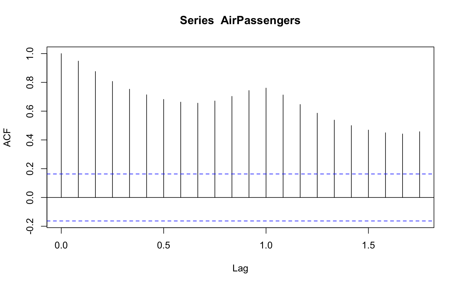
The Partial Auto Correlation Function
The Partial Auto Correlation Function (PACF) is a conditional correlation between a series and lag k, given the impact of the lags 1 to k-1 on the series. Likewise the pcf function, the pacf function is the corresponding function for calculating the PAC (Partial Auto Correlation) of a series with its lags:
pacf(AirPassengers)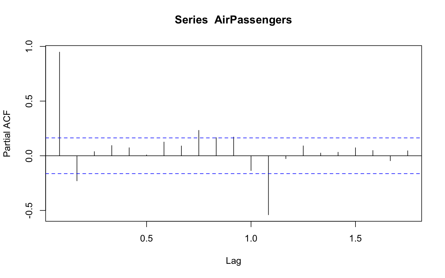
The key applications of the ACF and PACF functions are:
- Quantify the relation of the series with its past lags
- Identify and tune the AR and MA process order for ARIMA models (e.g., AR, MA, ARMA, ARIMA, SARIMA)
- Identify seasonal patterns
- Residual analysis and white noise test
ACF and PACF Wrappers
The ts_cor function from provides an interactibe wrapper for the acf and pacf functions, plotting both correlations:
ts_cor(AirPassengers, lag.max = 72)By default, the function marked the seasonal lags in red. You can use the seasonal_lags argument to mark additional seasonal lags (in case exists):
ts_cor(AirPassengers, lag.max = 72, seasonal_lags = 3)Lags Plots
The lag plot is a common method for visualizing the correlation between a series and its lags. The ts_lags function from the TSstudio package provides this functionality:
ts_lags(AirPassengers)As the relationship between a series and its past lag looks more linear, the higher the correlation between the series and the lag. In the case of the AirPassengers series, you can see that the series has a strong linear relationship with the first and seasonal (lag 12) lags, as observed before with the acf function.
The lags arguments enable us to plot the series against specific lags. For example, we could plot the relationship of the series with its past three seasonal lags (e.g., 12, 24, and 36):
ts_lags(AirPassengers, lags = c(12,24, 36))Correlation Analysis with the feasts Package
So far, the tools we saw above supports ts objects. As we saw before, the ** feasts ** provides wrappers for the stats main functions for time series analysis for tsibble objects. First, let’s convert the AirPassengers to a tsibble object:
ap_tsibble <- AirPassengers %>% as_tsibble()The ACF and PACF functions, as their names impay, provides a warappers for the acf and pacf functions. By default, unlike the origin functions it won’t plot the output and we will have to add the autoplot function to plot the results:
ap_tsibble %>% ACF(value, lag_max = 48) %>% autoplot()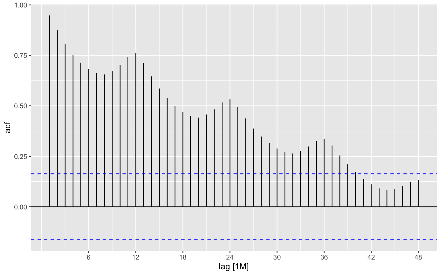
ap_tsibble %>% PACF(value, lag_max = 48) %>% autoplot()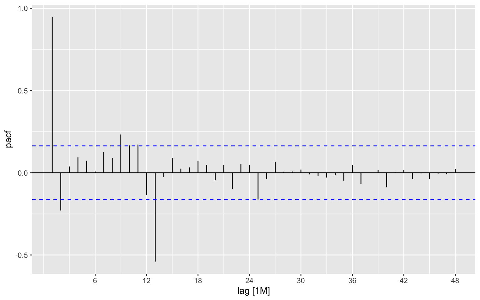
The gg_lag provides lag plots. The nice feature of this function that it colored the observations by their frequency units. By default, it used geom line, which I found a bit confusing, so we will set the geom to point:
p <- ap_tsibble %>% gg_lag(value, geom="point")

p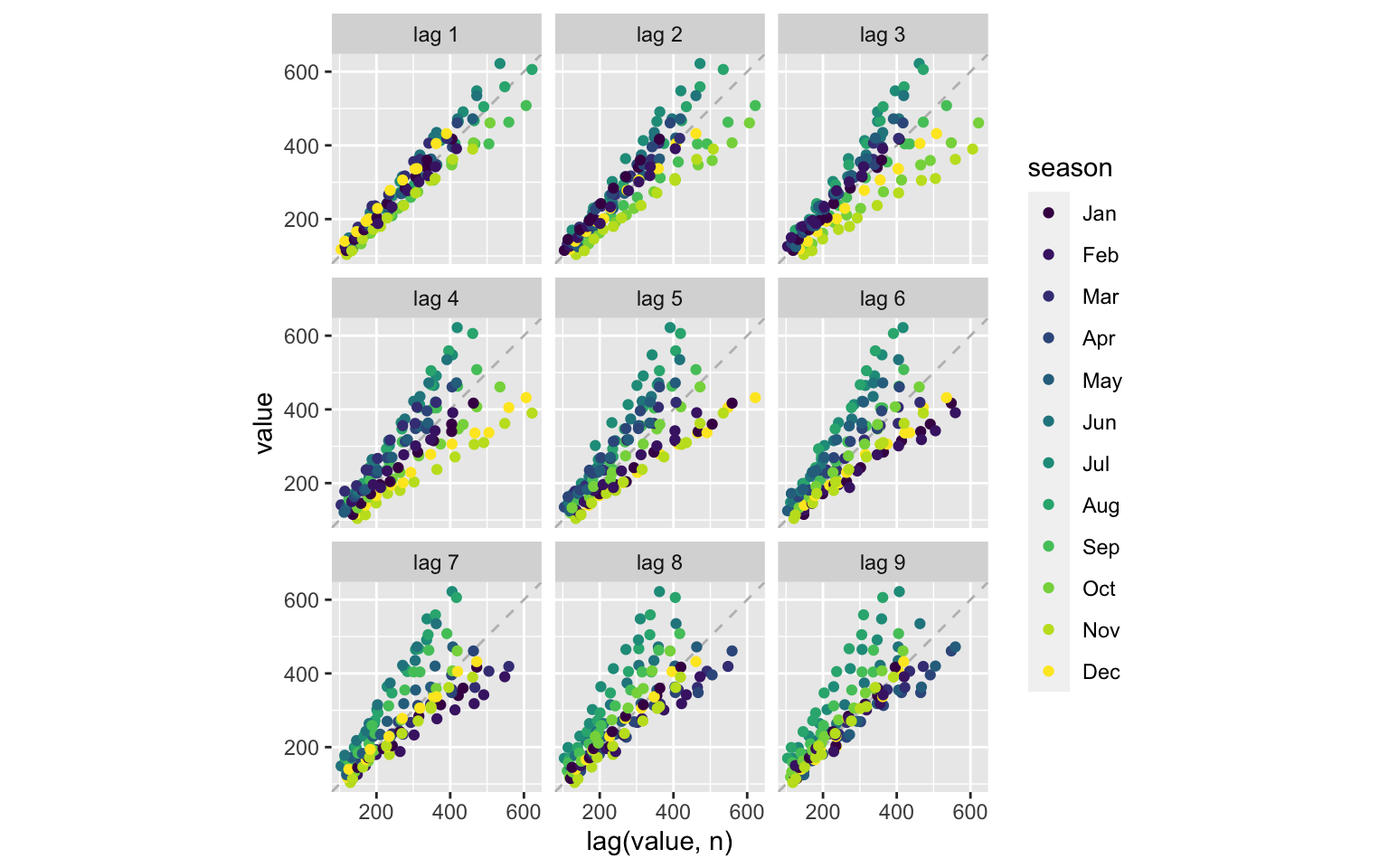
We can make this plot interactive by using the ggplotly function from the plotly package:
ggplotly(p)